First American was about to launch ClarityFirst, a large commercial real estate platform, and the brand had to do real work inside the product, not just on a splash page. Commercial real estate deals are high-stakes and slow to trust, so the identity had to signal trust and clarity across a sprawling application without tipping into cold and corporate.
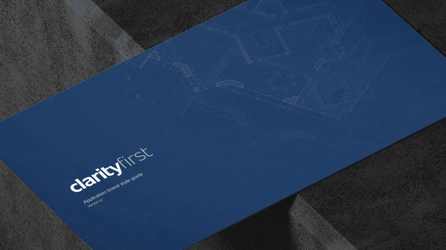
I led the branding ahead of the first public release: an identity built to carry authority at scale — tied to First American's heritage — and documented as an application brand style guide so it holds up consistently everywhere the platform appears.
Role
I led branding — creating the ClarityFirst identity and the application brand style guide for the platform.
What shipped
- Created the ClarityFirst identity to give a large platform real authority ahead of launch.
- Tied the brand to First American's heritage so the authority felt earned, not invented.
- Balanced authority with clarity — trustworthy without feeling corporate-cold.
- Documented it as an application brand style guide so it stays consistent across the platform.
Selected decisions
- Built the identity around a clear promise — get it done, zero stress — for high-stakes real estate transactions.
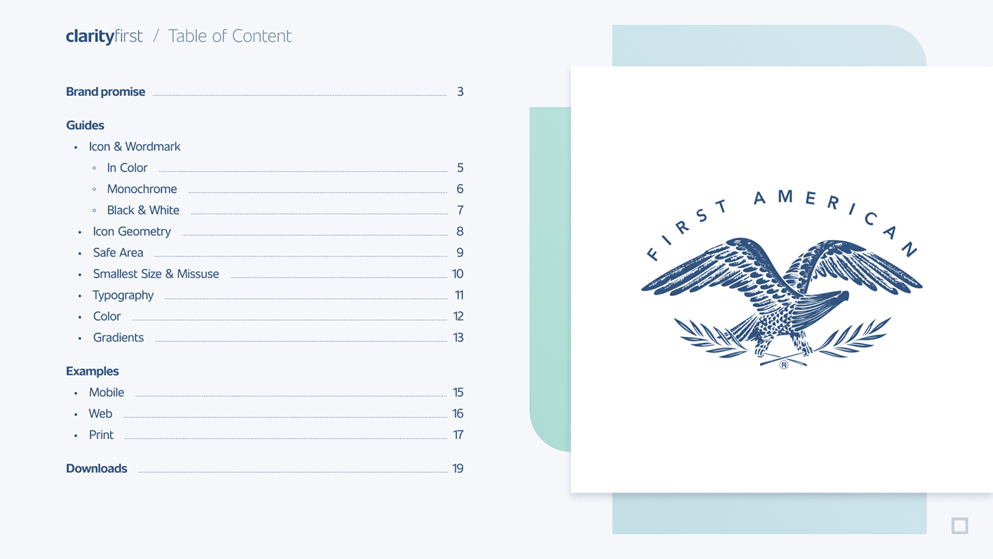
- Drew on First American's heritage, including its eagle crest, for a navy-and-teal identity that reads as established rather than freshly invented.
- Designed a precise wordmark and document-style icon to read as deliberate at any size.
- Balanced authority and clarity so a sprawling application feels trustworthy, not cold.
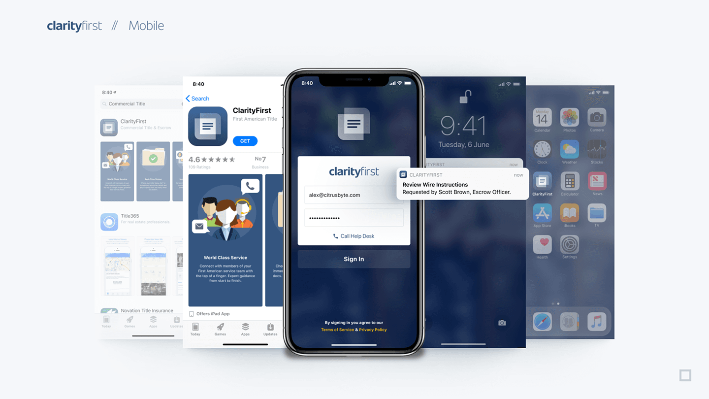
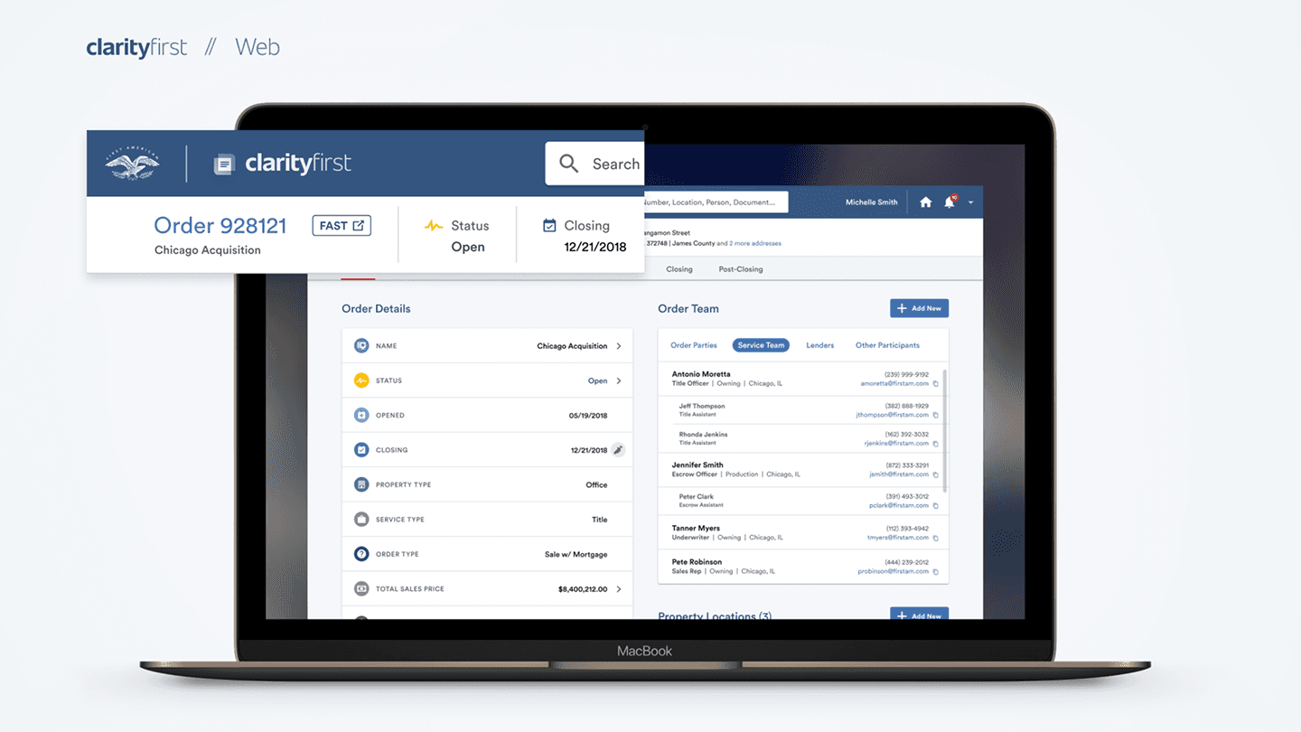
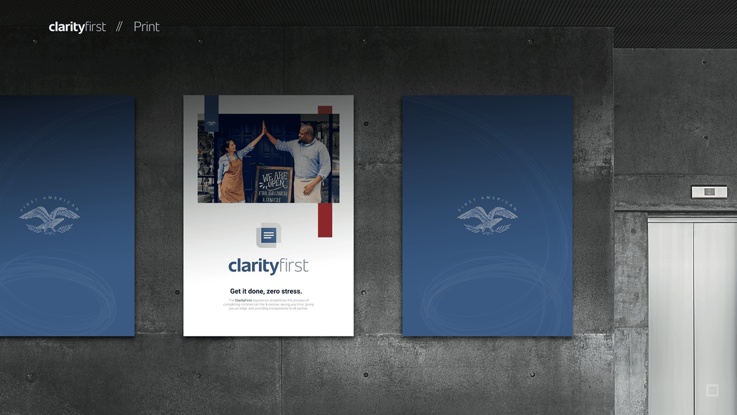
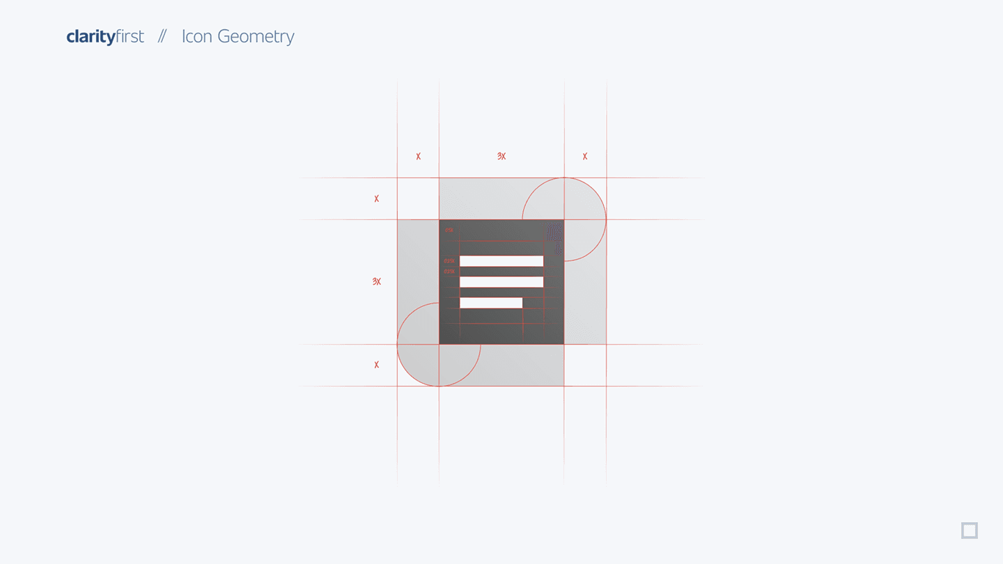
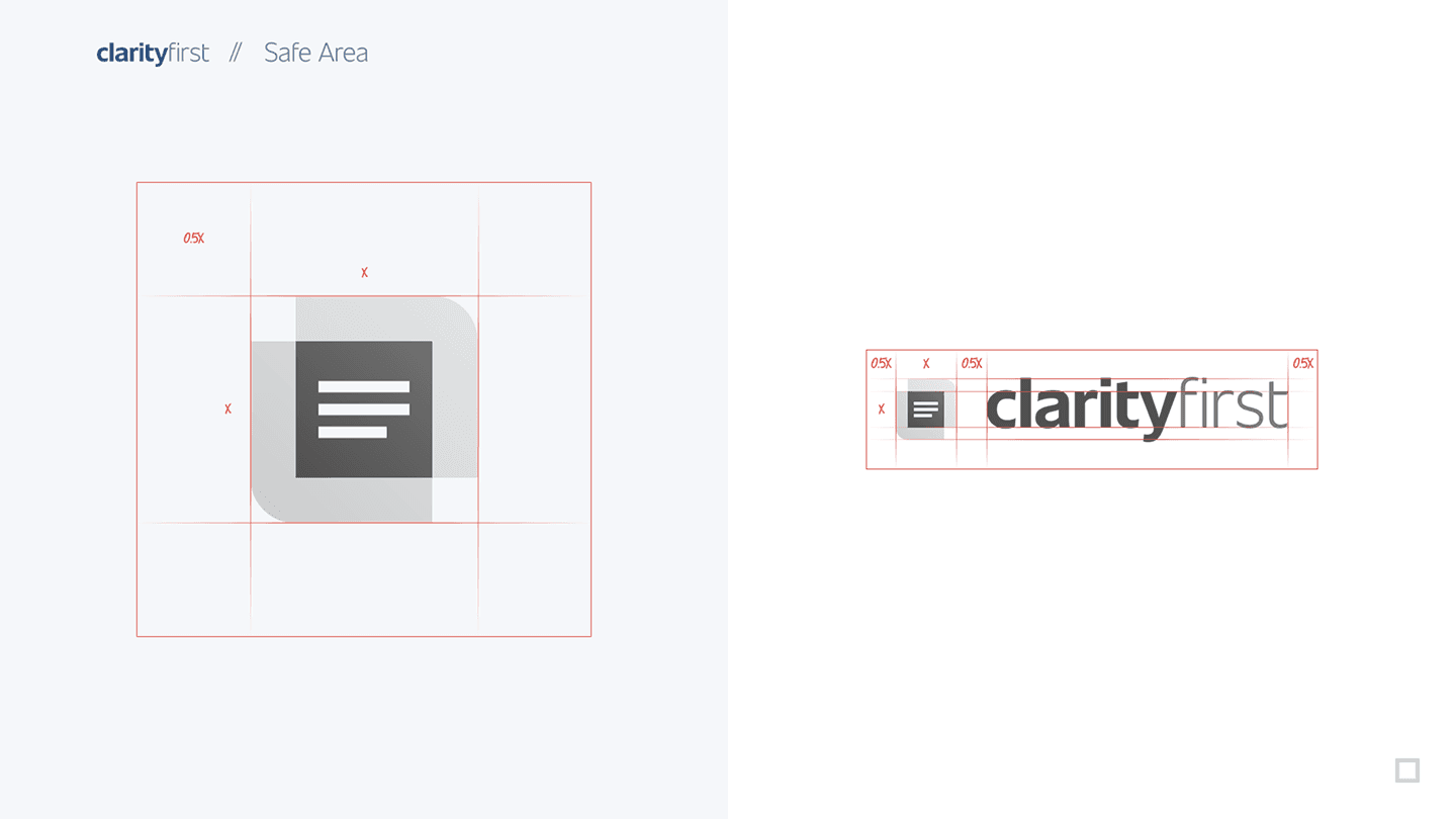
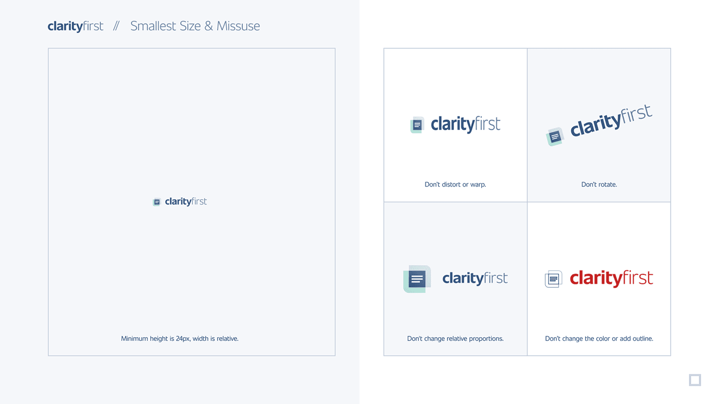
- Documented icon geometry, safe areas, minimum size, and misuse so the system holds as many teams and vendors apply it — across mobile, web, and print.
Walkthrough
A closer look
Authority for a platform this size starts with a clear promise — get it done, zero stress — and a lineage to stand on. The identity draws on First American's heritage, including its eagle crest, so the brand reads as established rather than freshly invented.

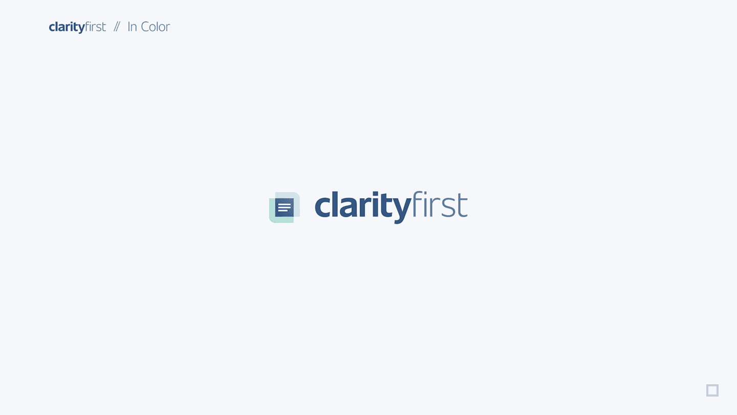
The wordmark carries that weight: a precise mark in navy and teal, worked out across the variations and lockups a platform needs so it signals a serious, trustworthy product at a glance.
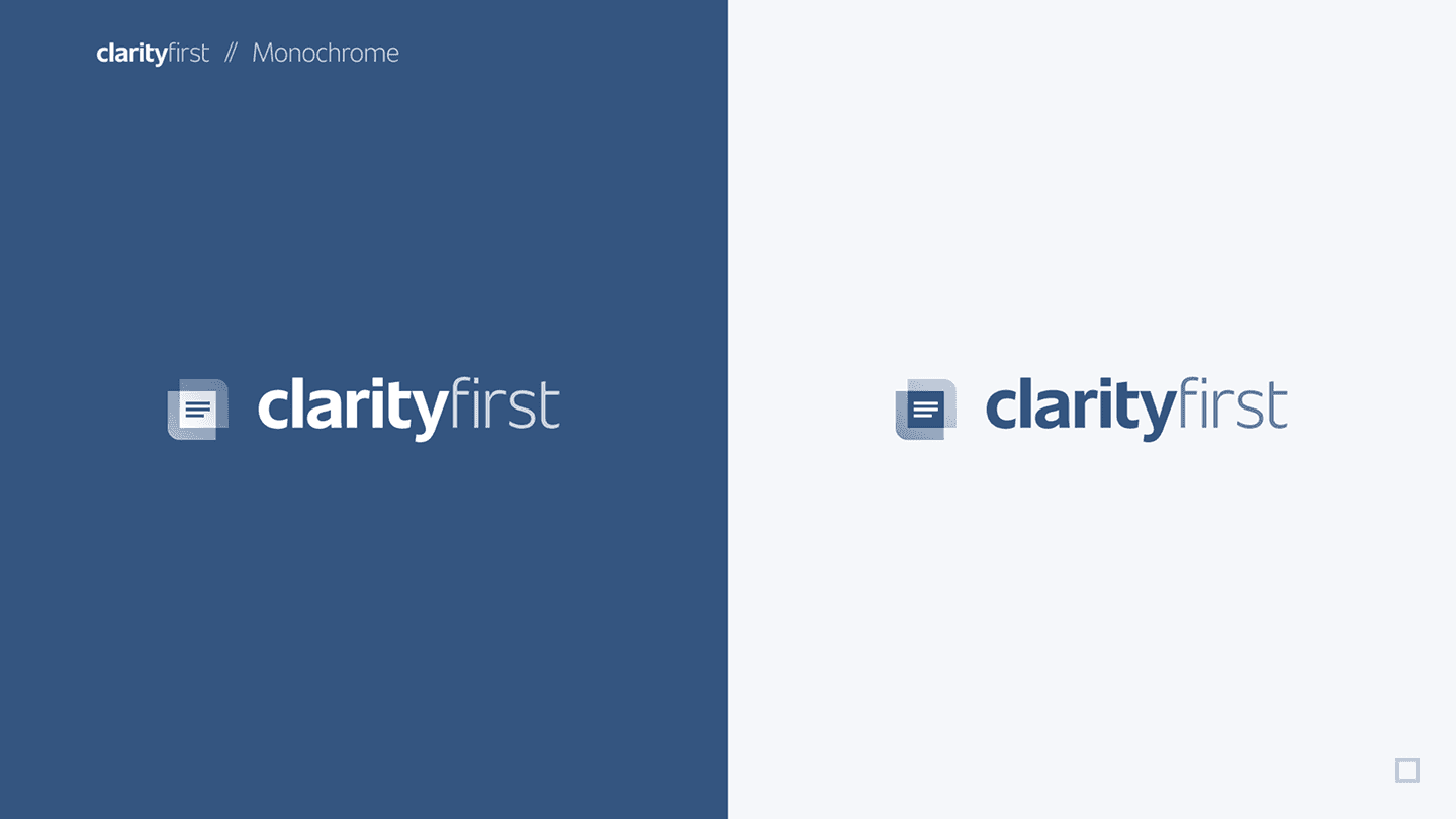
A document-style icon was drawn with the same rigor — its geometry, construction, and proportions specified — so the mark holds up as a favicon, an app glyph, or a watermark on a contract.
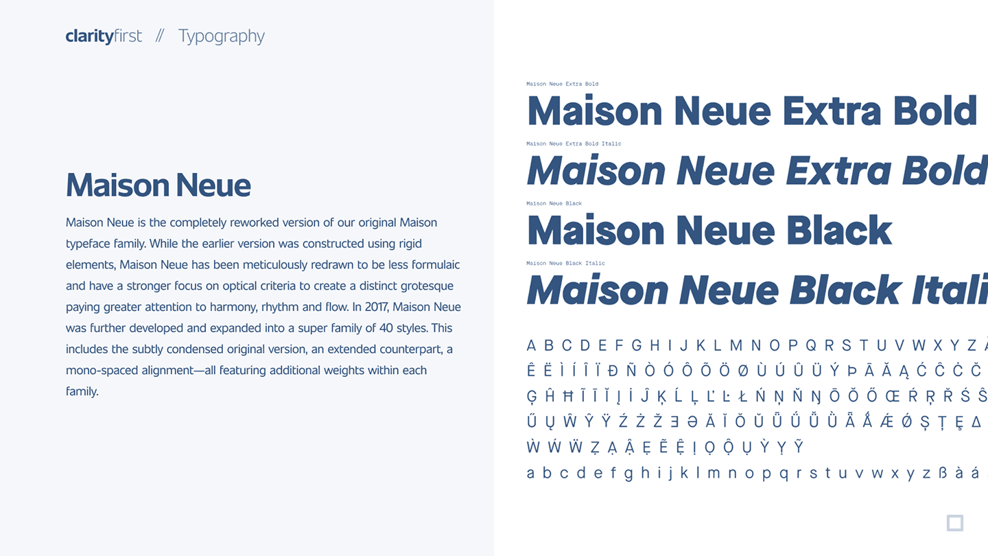
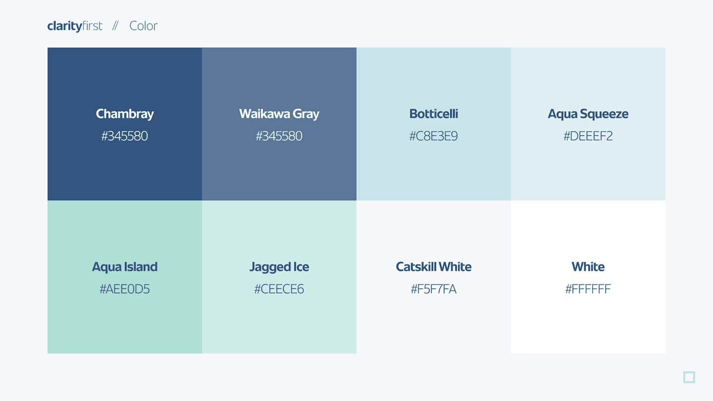
A type system in Maison Neue and a named navy-and-teal palette give every screen and team one voice, which is what keeps a large product feeling like a single, deliberate thing rather than many.
And because a brand at this scale passes through many hands, the guide documents the rules that protect it — clear space, minimum size, and misuse — so it stays consistent as many teams and vendors apply it.
The proof is in context: the system shown across color, the product UI, print, and environment, so the brand reads consistently wherever the platform turns up — which is the whole point of building it as a documented system rather than a logo.