Knowledge workers live in tab hell — pages, documents, videos, and notes scattered across dozens of tabs and apps, with the thing they need always one context-switch away. Edvo brings all of it into one connected workspace.
Edvo is built on a graph database, which links everything you save. The interesting decision was to hide that graph: a screen full of nodes and edges overwhelms more than it helps, so rather than make people read connections, the workspace surfaces the content and a powerful search and lets the graph work underneath. I led product design and the marketing site for the 0→1 venture.
Role
I led product design and the marketing site for Edvo, a 0→1 venture — from the core workspace and its search to the launch landing page.
What shipped
- Designed a workspace that pulls tabs, files, docs, and notes into one connected system.
- Made the call to keep the graph behind the scenes — surfacing content and fast search instead of a node diagram most people would find overwhelming.
- Turned an abstract graph-database concept into an everyday workspace rather than a visualization to decode.
- Designed the launch landing page and the brand that introduces it.
Selected decisions
- Brought tabs, files, docs, and notes into a single connected workspace instead of dozens of scattered apps.
- Chose restraint over spectacle: the graph database powers retrieval, but users get content and search, not a node map to untangle.
- Leaned on powerful search so finding something is faster than remembering where it lives.
- Built an instant context switcher, introduced by a playful mascot, to make juggling many things feel manageable.
- Kept onboarding light so the value lands in the first session.
Walkthrough
A closer look
The core move is consolidation: tabs, files, documents, notes, and the pages you're reading, normally scattered across dozens of apps, brought into one connected workspace so the thing you need is in the room rather than one context-switch away.
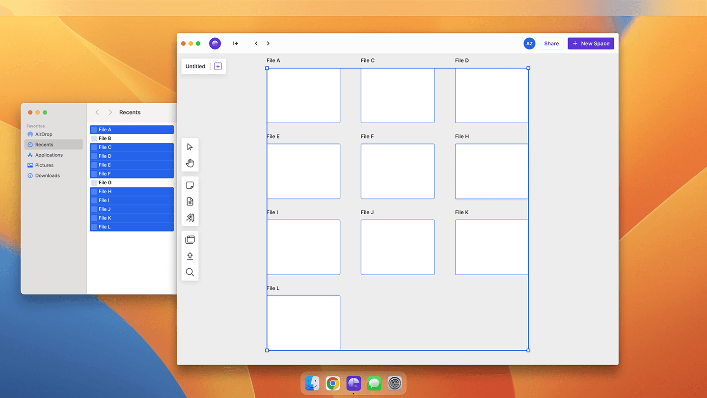
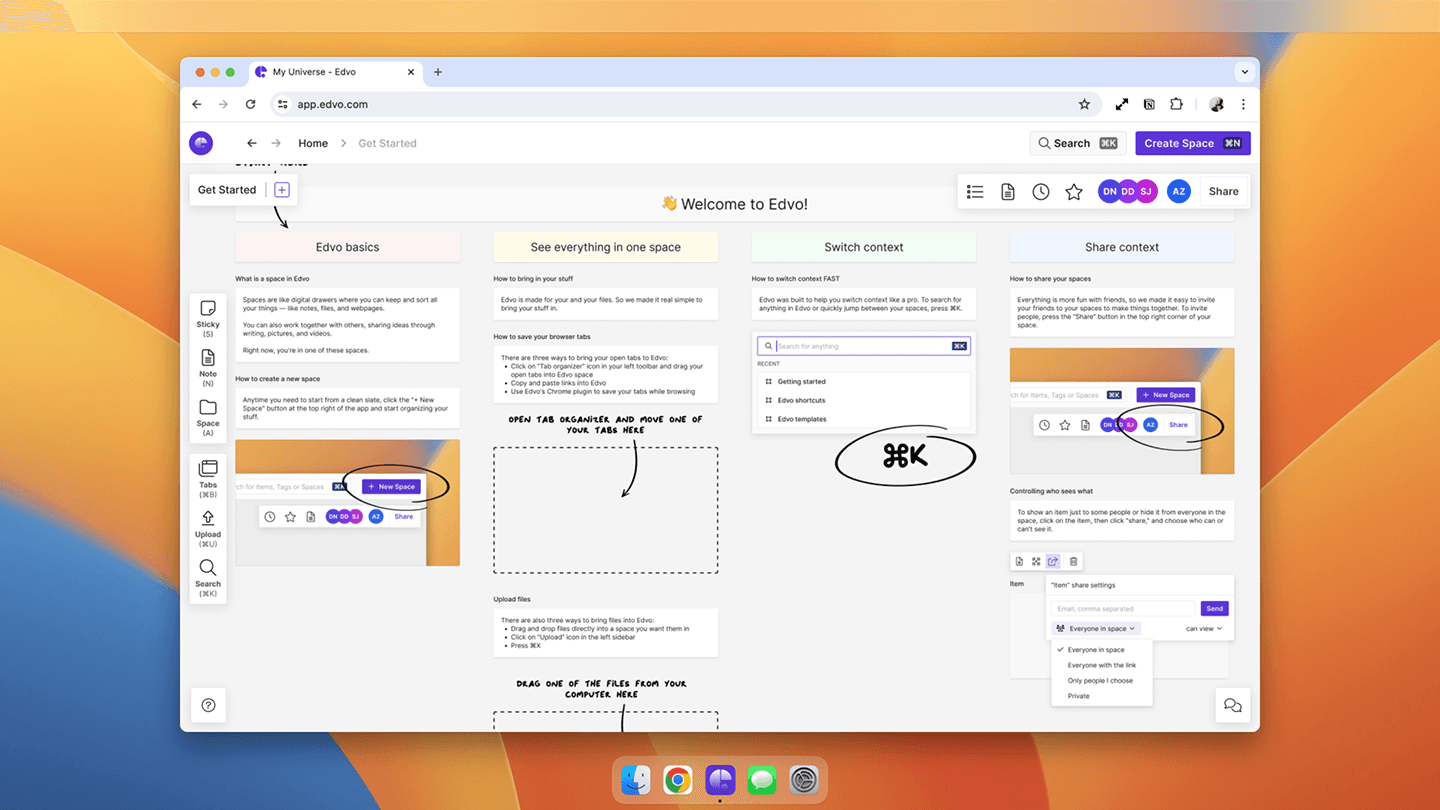
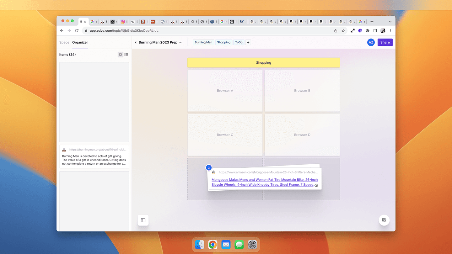
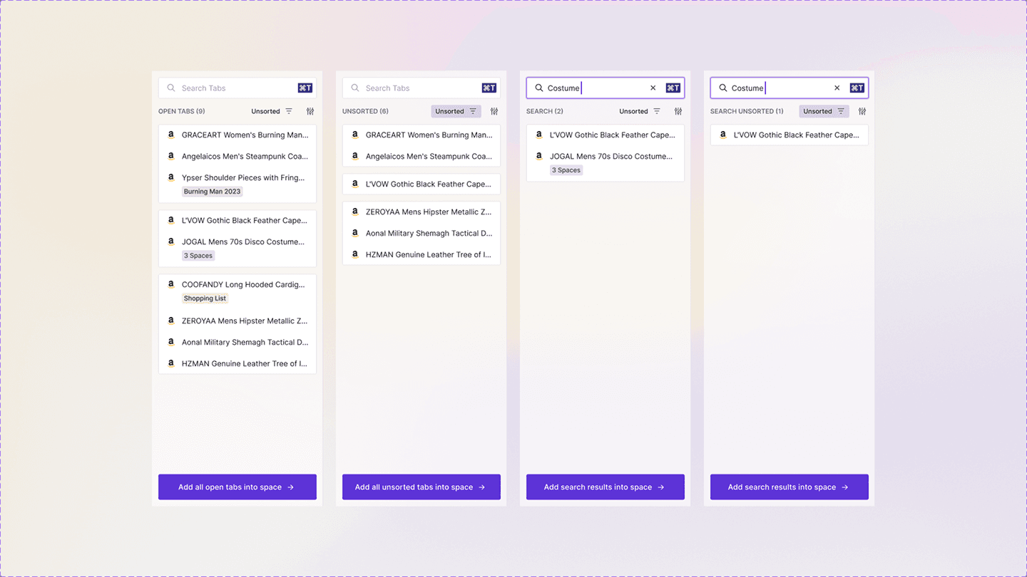
A workspace this broad can become its own mess, so the organizing principle was restraint: keep what people see simple — their content, on a board they can arrange — and let the connections live in the data rather than on the screen.
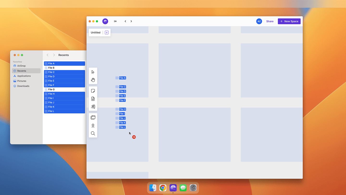
Under all of it is a graph database that links everything you add. Exposing that as a screen of nodes and edges would overwhelm more than help, so it stays in the data: you add things and find them again through search and a simple, arrangeable surface, while the connections do their work invisibly.
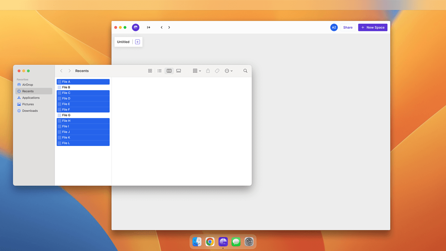
A workspace this broad needs an easy way in, so onboarding leads with an instant context switcher and a playful mascot that makes juggling many things at once feel manageable rather than overwhelming.
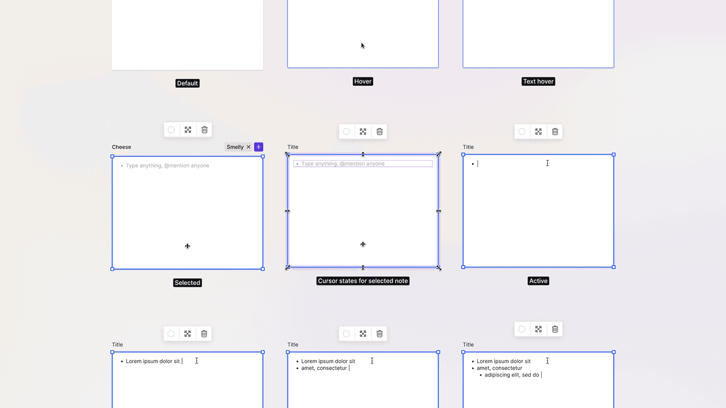
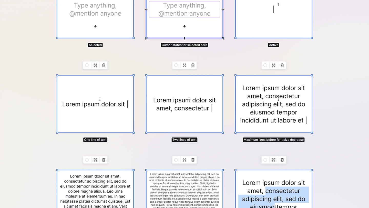
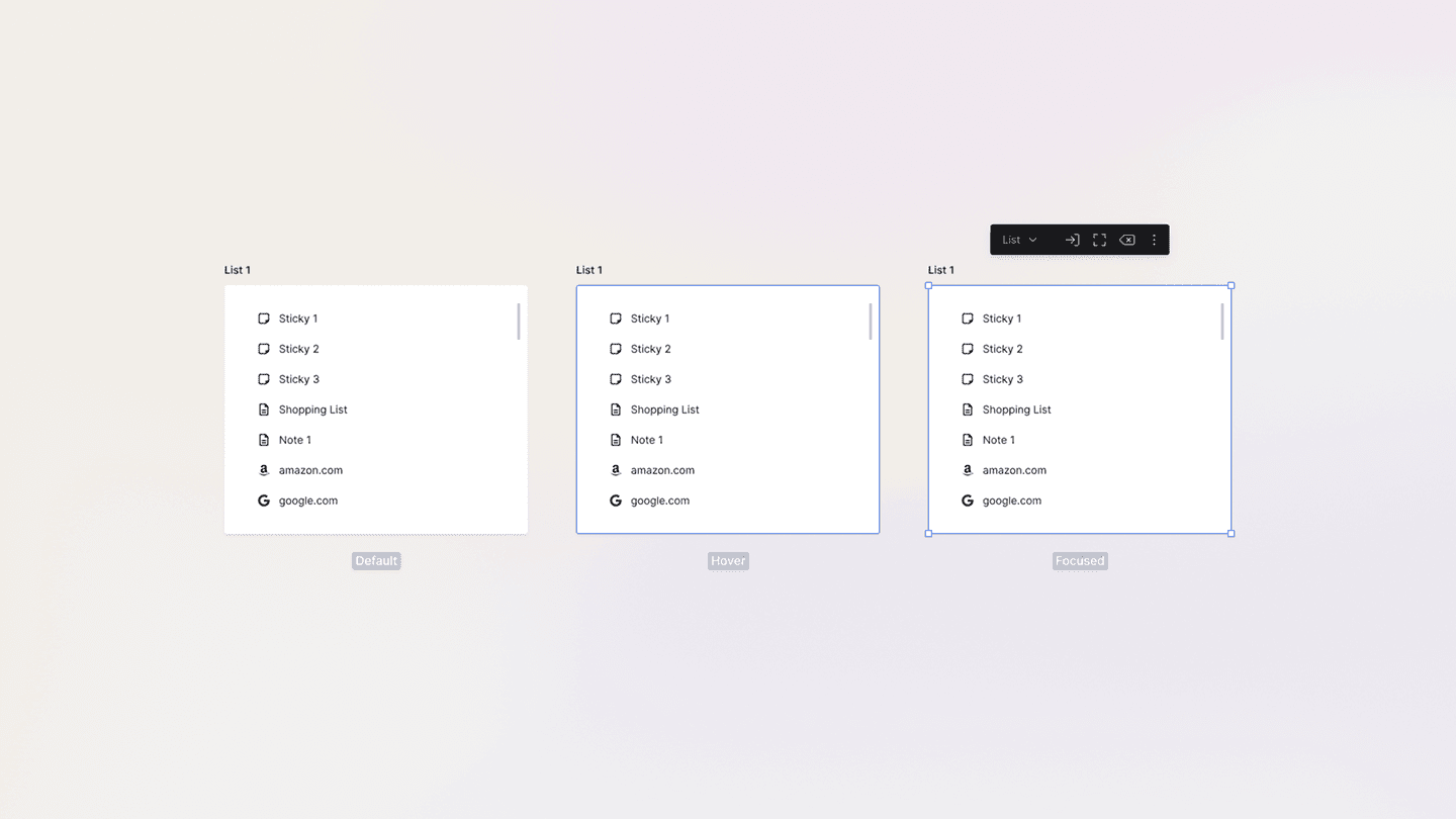
Getting there meant working the structure in low fidelity first. An idea this abstract is easy to over-design, and the wireframes kept pulling it back toward something simple enough to actually navigate.
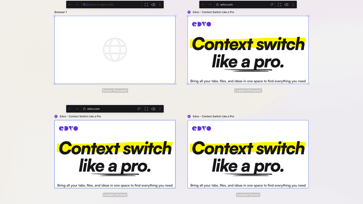
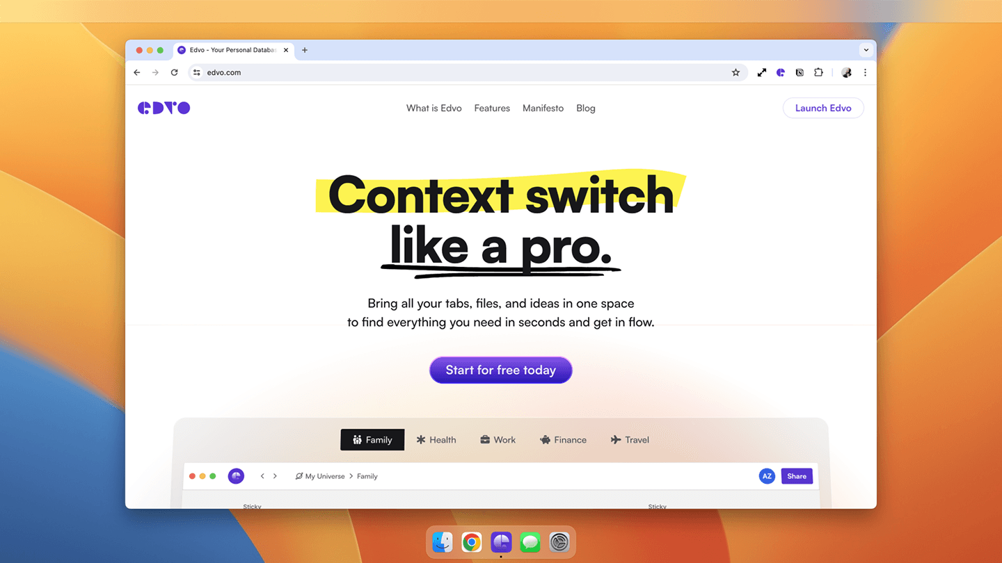
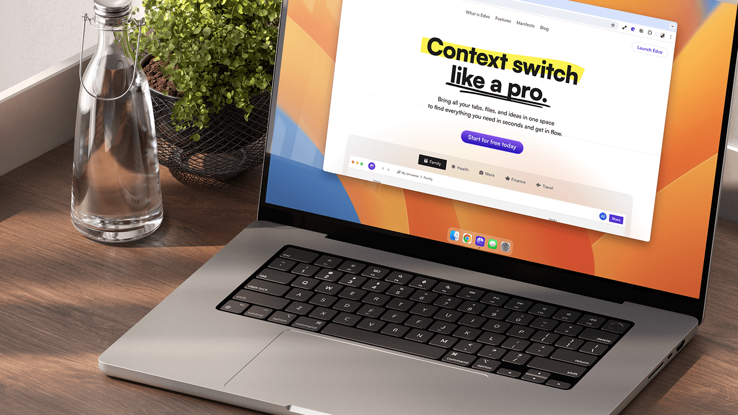
The brand and landing page carry the same promise plainly — context switch like a pro — so an unfamiliar product feels approachable from the first screen.