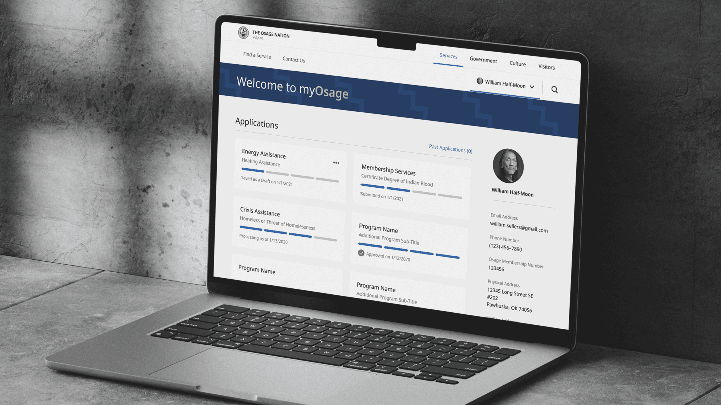
Osage Nation members needed energy assistance, crisis support, and membership services, but the path to each was fragmented and slow — hardest to navigate exactly when a member was already in crisis.
myOsage brings those services into one member portal, backed by a design system so the Nation can keep adding programs without rebuilding the experience each time. I led the service design and the system underneath it — simplifying intake, reducing barriers, and making critical help reachable when it's needed most.
Role
I led the service design and design-system work — mapping member journeys across programs and building the components and patterns that keep the portal consistent as it grows.
What shipped
- Unified crisis, energy, and membership services into a single myOsage portal.
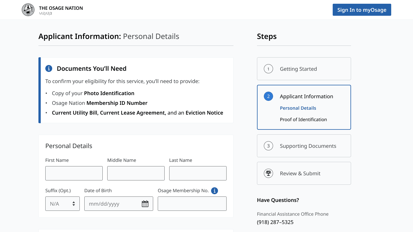
- Designed crisis-assistance intake as a guided, step-by-step flow built for high-stress moments.
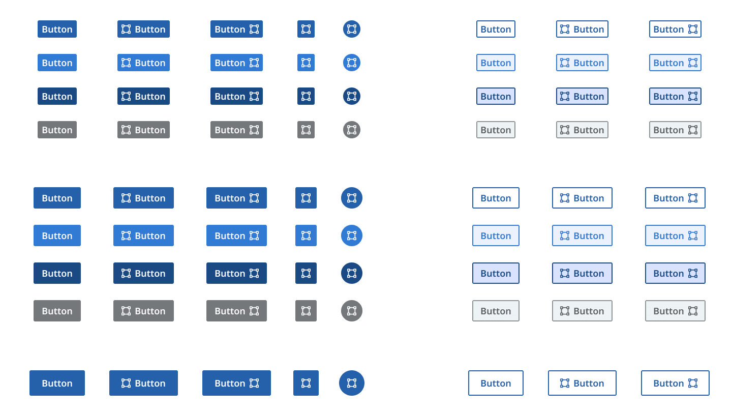
- Built a design system so new programs launch on a consistent, accessible foundation.
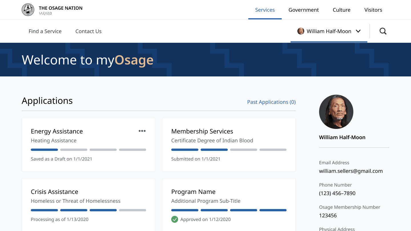
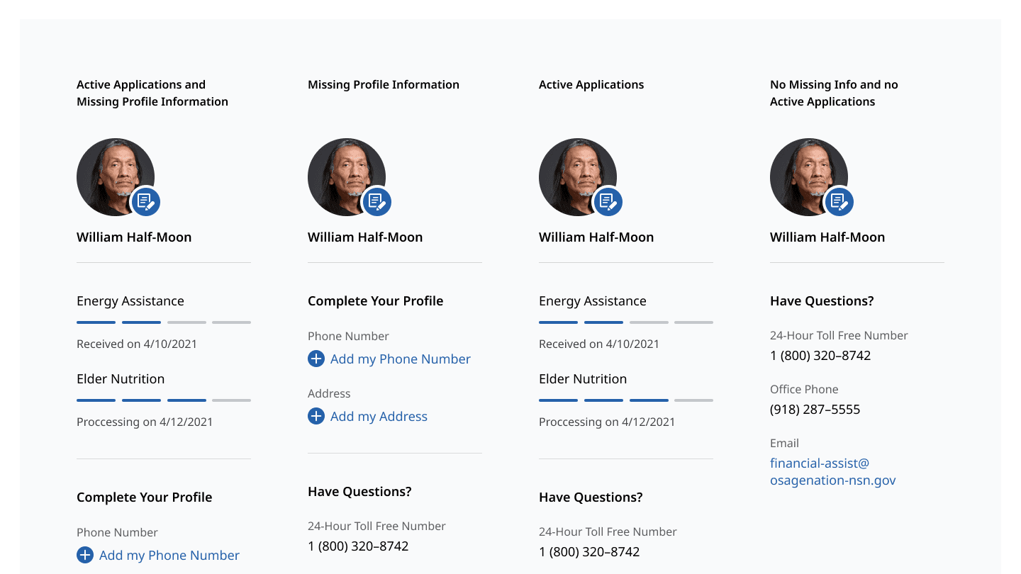
- Gave members a clear account view to track every application's status.
Selected decisions
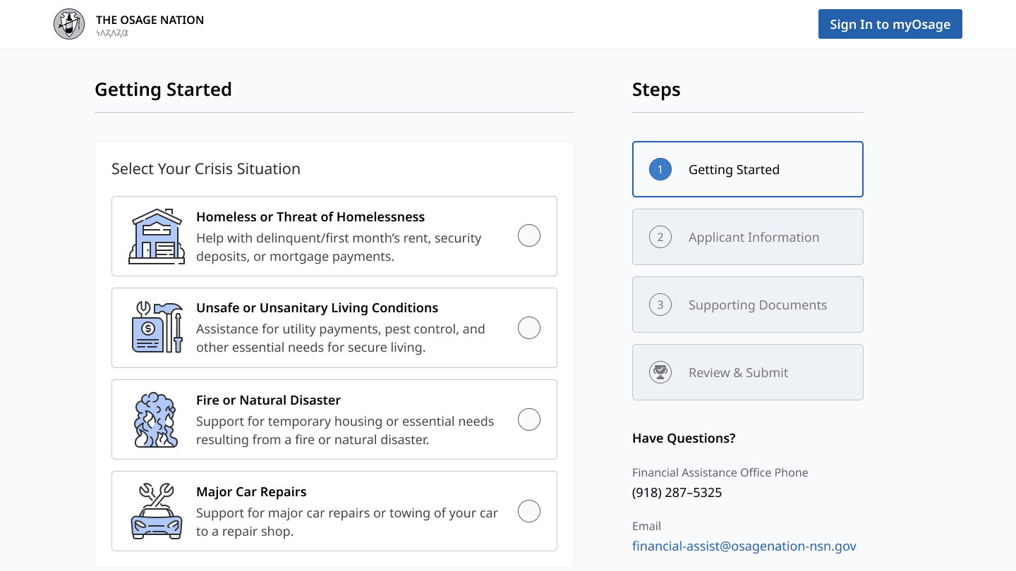
- Designed a guided application wizard — Getting Started, Applicant Information, Supporting Documents, Review & Submit — that breaks a daunting form into clear steps.
- Told members exactly what to gather up front with a Documents You'll Need panel, so people aren't sent back to the start mid-application.
- Gave each member a dashboard with live application status — draft, submitted, processing, approved.
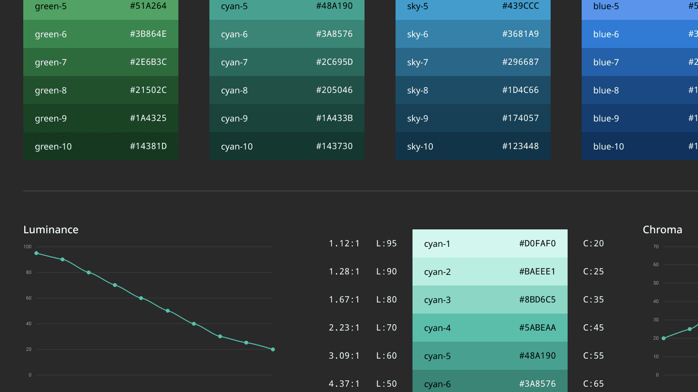
- Anchored the system in the Nation's identity for a portal that feels official and trustworthy.
Walkthrough
A closer look
Members reach for these services on some of the hardest days of their lives, and the old path to them was fragmented and slow — exactly when speed and clarity matter most. The design started from the moment of need, not the org chart of programs behind it.
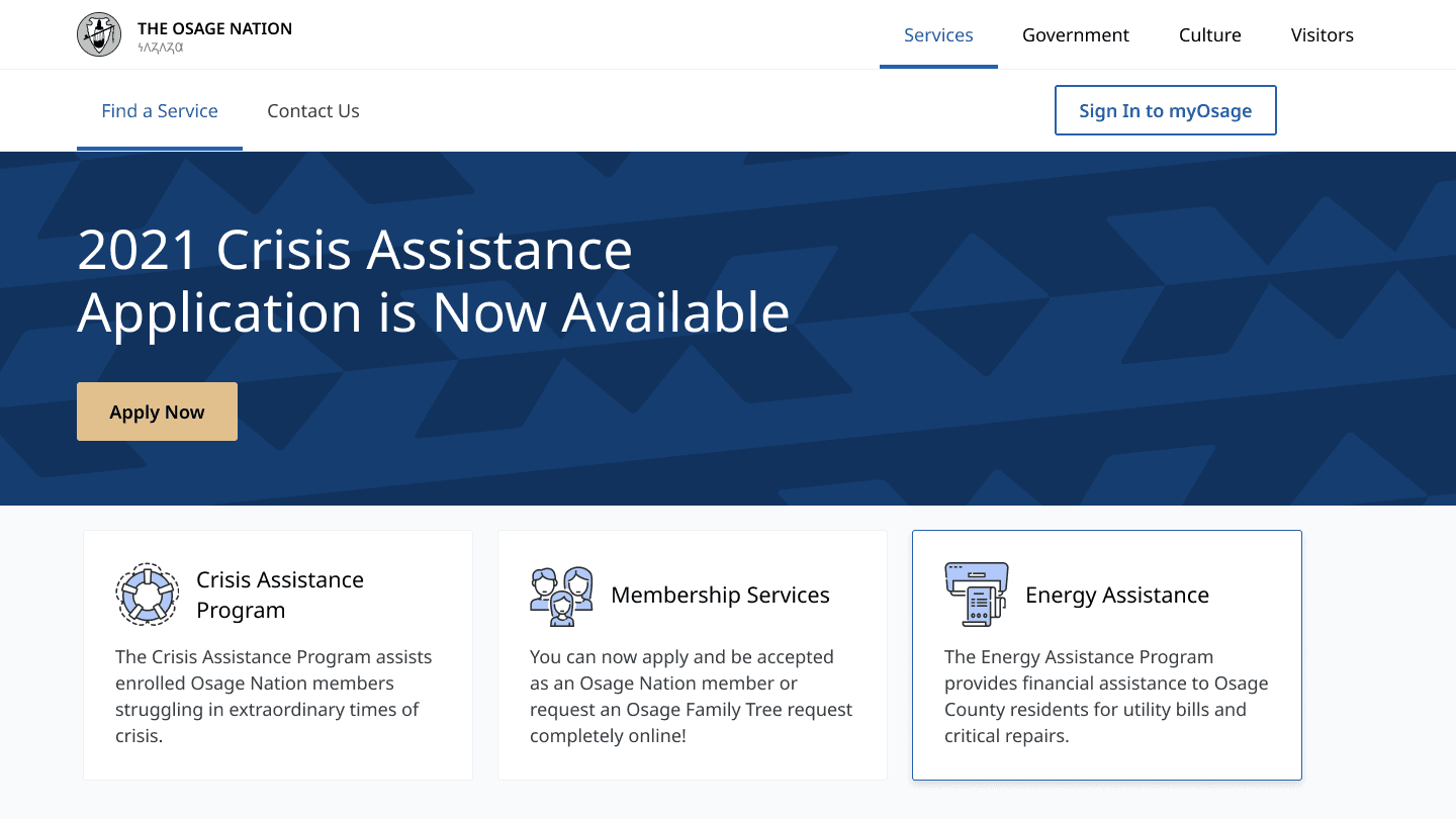
myOsage brings crisis, energy, and membership services into a single member portal, so a member has one place to find help and see where they stand.
Crisis intake is the heart of it. A daunting application is broken into clear steps — Getting Started, Applicant Information, Supporting Documents, Review & Submit — and a Documents You'll Need panel tells members exactly what to gather up front, so people aren't sent back to the start partway through.
Each member gets a clear account view to track an application's status — draft, submitted, processing, approved — so the process doesn't go dark after they hit submit.
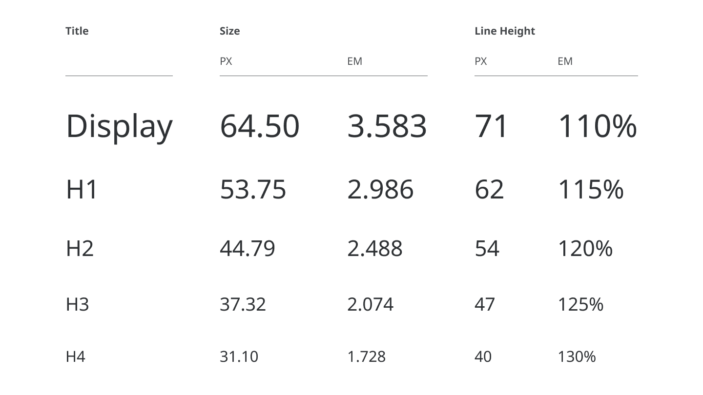
Underneath sits a design system — color, type, components, and patterns anchored in the Nation's own identity — so new programs can launch on a consistent, accessible foundation without rebuilding the experience each time.